The lion returns
The historic development of the Bayer 04 badge
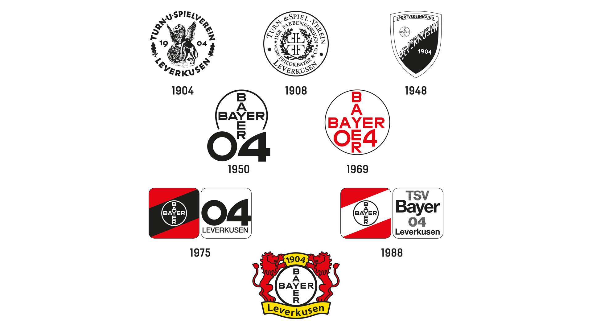
25 years ago, at the start of the 1996/97 season, the lion returned to the Werkself shirt. For the first time after seven decades the king of animals was back on the Bayer 04 badge on 17 August 1996 for the home game against Borussia Dortmund – in double. Two red lions hold up the Bayer Cross. That linked the new club emblem to an old tradition that related both to Bayer AG and the city of Leverkusen as well as the region of Bergisches Land. We look back at the historic development of the Bayer 04 badge.
In the beginning there was the lion. To be more exact: the Bergisch lion. He stands there majestic, winged and on both back legs, supporting himself with his front right paw on a globe and in the left he holds a Mercury's staff entwined with snakes, the symbol of trade. The first badge of the Turn- und Spielverein (TuS 04) Leverkusen, founded on 1 July 1904, can be traced back to the Bayer AG company logo.
In 1881, the open trading company of 'Friedr. Bayer et comp.' became the 'Farbenfabriken vorm. Friedr. Bayer & Co.' joint stock company and therefore needed a trademark for the first time. And because the company headquarters moved from Barmen to Elberfeld – both independent towns back then – the company was guided by the Elberfeld coat of arms: the two-tailed Bergisches lion, holding a black grid between its paws that the city’s patron Saint Lawrence, was supposed to have been martyred on.
14 years later in 1995, Bayer had developed into an international company and wanted to express that in a revamped company logo. The two-tailed lion with the grid became the winged lion with a Mercury's staff and globe that represented self-assurance and open-mindedness.
THE LION HAS TO GO
The football section of TuS 04, founded on 1 June 1907, also used that badge for 16 years. They only had to have their own badge when the footballers split off from TuS 04 1923 to form the 'Fußballverein 04 Leverkusen'. The lion had to go with the letters F, V (white on a black background) and L (white on a red background) plus the number 04 coming together to form a simple new badge.
The next new formation was in 1928: The merger of footballers, boxers, field handball players, athletes and fistball players saw the creation of the 'Sportvereinigung Wiesdorf-Leverkusen 04'. The creation of a badge did not happen at first as this "had to be well considered" as the club announced.
THE Bayer CROSS in the centre
When exactly the club produced the first badge with the Bayer Cross cannot be said with any certainty. The use of the cross however, even if with the delay, once more reflected the works. In 1904, the paint factories simplified their logo due to the expansion of exports worldwide with the Bayer Cross replacing the lion as a trademark and was registered at the imperial patent office.
In 1935, five years after the city of Leverkusen was founded, the Sportvereinigung became an official works club bearing the Bayer name. The club was now called 'Sportvereinigung Bayer Leverkusen 04' and the club name is combined with the Bayer Cross in a red and black triangle on the badge.
During the Nazi dictatorship, a lot of German clubs had to reorganise and be renamed, which led to unwieldy club names. So, 1938 saw the creation of the ‘Betriebssportgemeinschaft der I.G. Farbenindustrie A.G. Leverkusen 1904’, which two years later turned into the ‘Kriegssportgemeinschaft TuS 04/Bayer Leverkusen’.
'Bayer 04' as core element of simple design
When the first edition of club information appeared on 19 October 1947 – the forerunner of today's print publications BayArena Aktuell and Werkself Magazin – value was placed on creative unity in relation to the club badge. The white Bayer Cross is in a hollowed circle on the numbers 04, the founding year of the whole club. That graphically represented the short form established by the then press officer Walter Scharf at the same time in the club information: The Sportvereinigung Bayer 04 Leverkusen is now mainly just called 'Bayer 04'. This core element of a new, simplified presentation was now used on official letterheads, pin badges for club anniversaries, posters and as a sign on the entry to the stadium at the Stadtpark. The championship winning team of 1951, who were first promoted to the Oberliga West, wore the badge as a triangular crest on their chests.
Up to the middle of the 1970s it is used in several variations actually realised Walter Scharf's hoped-for "necessity for simplification and longevity."
the double badge arrives
At the start of the 1970s, the group advertising department of Bayer AG were given the job of harmonising the graphics of all Bayer sports clubs. The concept of the double badge came into being: On the left of two rounded squares are the club colours in slanted stripes with the Bayer Cross placed in the middle and on the right the emblem of the relevant group club – in the case of the football department the colours of black and red remain with the right square showing the foundation year with the city name of Leverkusen. In 1977, Bayer 04 produced a first satisfied summary in a display in the 'Stadionkurier': "Our club has presented itself in a new, simplified style for over two years. The modern appearance has been positively received by members and friends of the club."
While the group clubs wanted to have a more modern and contemporary design, the lion remained the central element in the city coat of arms of Leverkusen. After local government reorganisation in 1975, Leverkusen received its new and remaining city coat of arms that shows a two tailed red lion with a blue crown, blue tongue and blue claws are plus a centrally placed black castellated bar.
For Bayer 04 there are major changes nine years after the introduction of a double batch: After decades of separation SV Bayer 04 and TuS Bayer 04 Leverkusen are merged on 1 July 1984 into the overall club of TSV Bayer 04 Leverkusen. That brings a change of colour to the badge:, Black and red turns into white and red and accordingly the Bayer Cross is black on a white background. The rounded squares remain. Up to today, this graphic concept of division into two remains on the badges of all the Bayer sports clubs.
Lion as a mascot – the separate path of the football players
Only the football department was able to go its own way in 1996. Two years earlier, the lion and become the official mascot for the football players. A lot of fans express the desire to see the king of the animals come back to life on the club badge. It was recognition of the tradition of the club, Bayer AG and the city of Leverkusen. On the new badge, two red lions hold on tightly to the round Bayer Cross. Above and below, on a yellow background are the dates of the foundation and the city name Leverkusen. "In keeping with the times this also represents a way back into the past. […] True to the old symbols on the company sign; pride, self-assurance and open-mindedness are to be expressed on the new badge of the Bayer 04 first team,” was announced by the ‘Stadion-Kurier’. And general manager Reiner Calmund was a strong advocate of harking back to the lion on the badge.
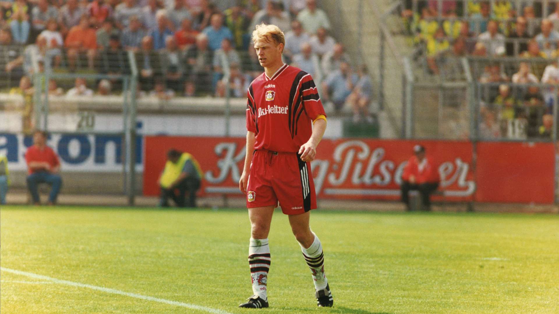
And so the team under the then coach Christoph Daum wore the new lion badge on their shirts for the opening game of the season against Borussia Dortmund on 17 August 1996. Bayer 04 beat the reigning champions 4-2 in a thrilling encounter. It is a start to a great season that not only ends in a completely unexpected runners-up spot but also after nearly being relegated a few months before the start it was the beginning of a new era under the Bayer Cross. The return of the lion to the club badge actually appears to go with a new pride, self-awareness and open-mindedness.
The badge was only reworked once in 2002 after a redesign of the Bayer Cross. The graphic adjustments only affected details like the strength of shapes and lines as well as the font. Every else remains as it has been in the past 25 years.


