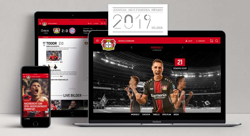
The independent Annual Multimedia Award is one of the most important and long-standing digital competitions in Germany, Austria and Switzerland and, since 1996, an expert panel selected each year presents awards to outstanding multimedia projects. The accompanying yearbook is considered to be an exemplary collection and provides a shop window in the industry for the state-of-the-art, trends and developments in digital brand communication and design. Bayer 04 join an illustrious collection of other Silver Award winners for websites including those of Audi, Otto and Kästle Ski.
Bayer 04's excellent new website was launched for the start of the season 2017/18. Two aspects are of prime importance in the design: Clarity and simplified navigation – as nothing is more annoying than having to keep on clicking to reach the desired content. The design of the website is therefore based on a somewhat adaptive form of the so-called Atomic Design. It structures the individual pages (hubs) in vertical sections and elements. In turn, that enables the flexible use of function areas in the background. That makes it easier and quicker to produce additional pages.
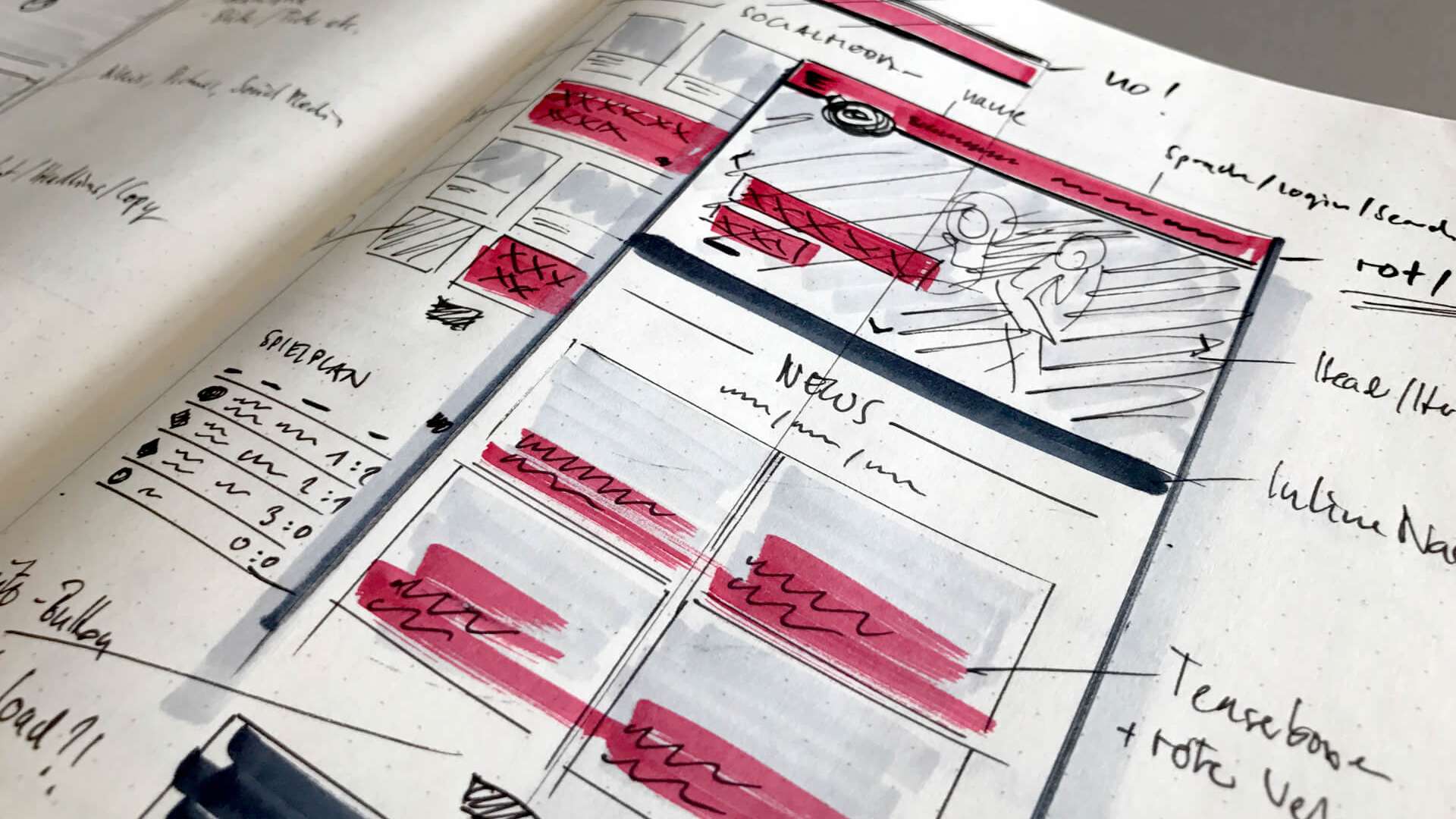
The hamburger button in the header that contains all the relevant pages also provides greater clarity. The Bayer 04 site looks tidier and provides sufficient room for the most important things from our perspective: large photos, full screen image slider and lightbox galleries. Attractive statistics and tables. Animated news elements.
In contrast to current design trends of many websites, that have a rather more neutral and almost indistinguishable look, the Bayer 04 website consciously uses graphic elements such as bands, lines, typeface and colour fields from our corporate design. That produces a consistent and clearly identifiable look in Black and Red.
There is also huge pleasure for the Silver Award at the Düsseldorf agency Staygolden That was responsible for the development and design of the graphic user interface.
Related News

A new chapter | Ibrahim Maza: Family and religion provide greatest support
Ibrahim Maza joined Bayer 04 from Hertha Berlin in the summer of 2025. The youngster from Berlin developed into a difference-maker in his first season with the Werkself. Find out what makes the highly talented player tick in this very personal interview. Among other things, Maza talks about his Algerian-Vietnamese-German home, the role of his family and the importance of Islam for him both in his private life and in football...
Show more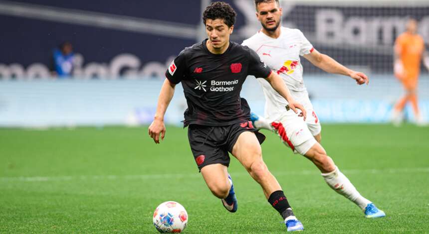
Vote now for Ibrahim Maza to be Bundesliga Rookie of the Season!
Bayer 04’s Ibrahim Maza is among the three nominees for the Bundesliga’s 2025/26 Rookie of the Season award. Fans have until 23:59 CEST on Thursday, 7 May to cast their votes in the official Bundesliga app.
Show more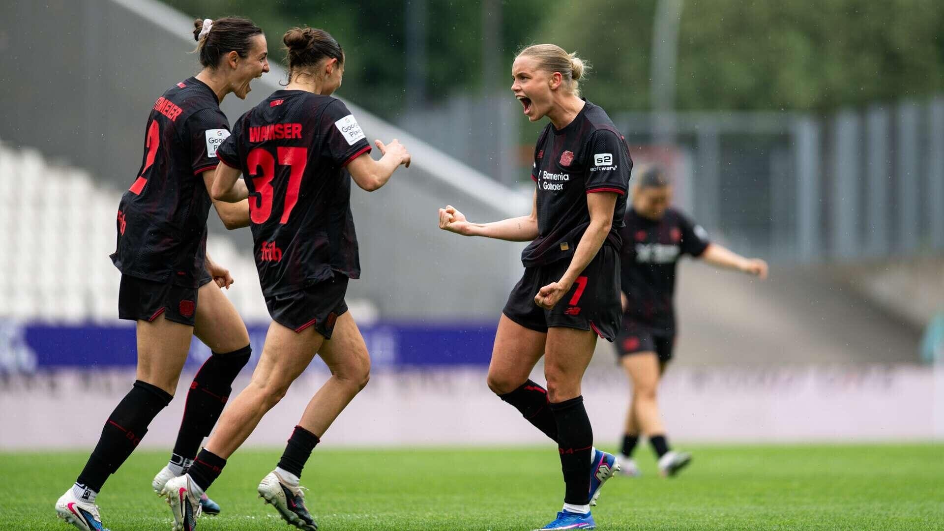
Women: TV-highlights of 4-0 win at SGS Essen
Werkself-TV shows the highlights of the Bayer 04 women's 4-0 win at SGS Essen on the 24th matchday of the Google Pixel Frauen-Bundesliga 2025/26.
Show more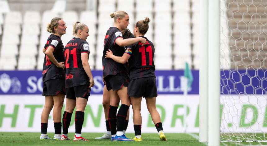
Bundesliga record for the Werkself: Women celebrate 14th win of the season in Essen
The Bayer 04 Women have kept their chance of qualifying for the Champions League alive in the Bundesliga run-in. Coach Roberto Pätzold's team won 4-0 at SGS Essen on Sunday afternoon, improving their record from last season to 14 wins this term. With 43 points, the Werkself equalled another record from the 2024/25 season and at the same time reduced the gap to third-placed Eintracht Frankfurt to two points, at least for tonight. Loreen Bender (4’), Kristin Kögel (41’, 68’) and Cornelia Kramer (89’) scored for the Black and Reds, who dominated the game to record their fourth win on the bounce.
Show more